Membership Website @ CrueTV
October.2018 - March. 2019, a 6-month project
My responsibilities include:
Conduct user research through shadowing, interviews, surveys, to define pain points of different user groups, and provide creative solutions to improve the business at CRUETV.
Develop user personas, journey maps and infographics to present and analyze outcome and business model. Create sitemaps, wireframes, mockups to communicate concept and design rationales, and conduct user testing to collect feedbacks and reiterate.
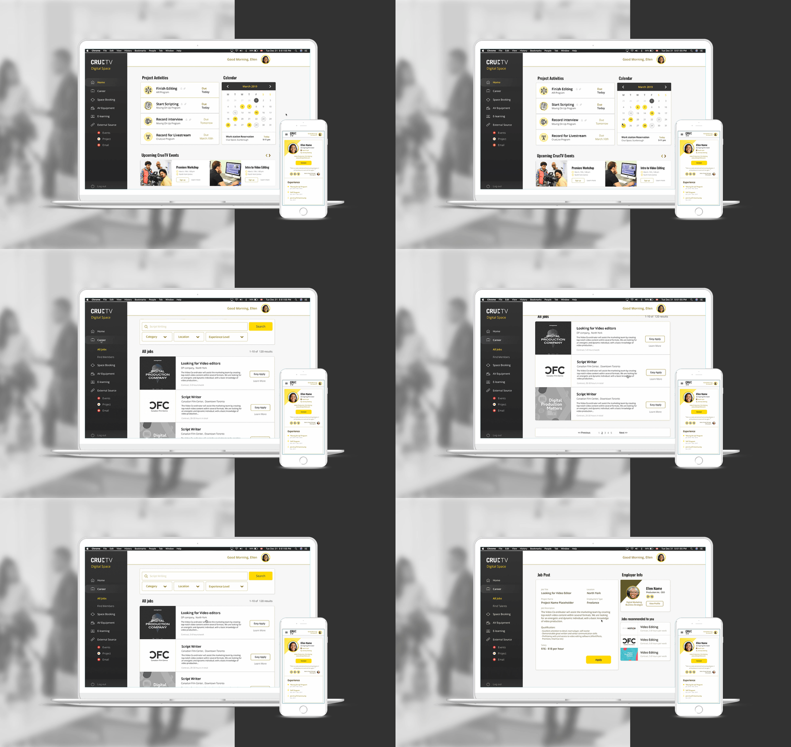
Web System Design: a public section for program and membership information, and an internal section for skill training, space booking and equipment rental.
Phase 1: Onboarding
What’s CrueTV?
CrueTV Digital Media provides skill training, co-working space and digital production services for its members, especially youth who do not have access to school education, and looking for learning and working opportunities.
How it works?
CrueTV develops partnership with digital production companies to offer skill training workshops and paid work opportunities to their members, as well as digital production equipment rental and co-working space.
▲ I created this Business model map to present to the stakeholder, and visualize their key business
What’s our task as designers?
Work with another 2 designers, we formed a multi-disciplinary team to solve the problem exists in the physical and digital space of CrueTV, and our goal is to design an ease of access experience for members to engage with CrueTV’s business.
Phase 2: Research
In Phase 2, we conduct user research by employing enthonograephic research methods, from observation to user interview and survey in order to define the key problems.
Observation and Photo Diaries
We went to their current work space and join the workshop events to observe members’ behaviour. By analyzing the documented photos and audio records, we are able to build the empathy and get a deeper understanding of their experience.
2. User Interview & Surveys
We conduct user interviews with 2 current cruetv students, 1 past student and 1 business partner. Questions include the frequency of using website, information resource, what could be improved in the membership plan and current experience, etc..
Interview Questions
Direct Quotes from user interviews
3. Market Research
We also did market research to analyze other competitors, e-learning platform and technologies to come up creative solutions that could be applied to the current business.
Highlighted my roles in market research
Phase 3: Problem Statement &
Ideation
Based on all the research, we identified pain points of students, clients and CrueTV, and how to connect the problem and resource from these 3 pillars to redesign the experience.
Persona and Pain points
Pain point Analytics and Resource Optimization
Resource Connection and touch point
Solution: Digital Space
Our idea is to redesign both the physical and digital space to improve the membership experience at CRUETV. I am leading the design of the digital space which will facilitate the employment process of students and the client by providing students’ profile, job board, event registration, space and equipment rental, and help CRUETV to track the whole process for future opportunities.
Information Architecture Design
Website consists of a public session and an internal session
“Yes, we are developing the skill training programs, but once they are out of the programs, what we are trying to do now is to make sure all these members could be tracked and going forth so that employers could have access.”
Phase 4: Design
1. Wireframes & Low-fidelity Mockups ▼
I created these wireframes and low-fidelity mockups as the first step of ui design to figure out the layout of information and present my ideas during meetings.
Rapid prototype created in Adobe Comp and Figma
3. User Testing
Since we are a small team and don’t have enough time and resource to conduct user testing with high-fidelity deisgn, we created these low-fidelity prototype in Figma to gather more feedback at the early stage.
1st Version
Users could type in the time slot that works for them, and a rectangle represents the length shows up on the schedule form.
2nd Version
Considering the limited equipment CrueTV has, we decide to set time limitation for each person. We also decided to only present the available time slot rather than the whole schedule form, as what people really care about is the time they could use the equipment, not “what time it is booked“.
Final Design
▼ Clickable Figma prototype - Public Website
▼ Clickable Figma prototype - Internal Member System
▼ Clickable Figma prototype - Internal Member System (Mobile)
Design Style Guideline


· · ·
To find more about my design skills, please see projects:


